Clicking on any image will take you to a much larger file with more detail visible.
As you know, I'm a sucker for all things French, Parisian, and especial Marie Antoinette. So, it'll be no surprise that my latest mini album (can an album is almost 11" tall be considered a "mini?") is filled with portraits, both formal and gently satirical of one of the most famous monarchs in history.
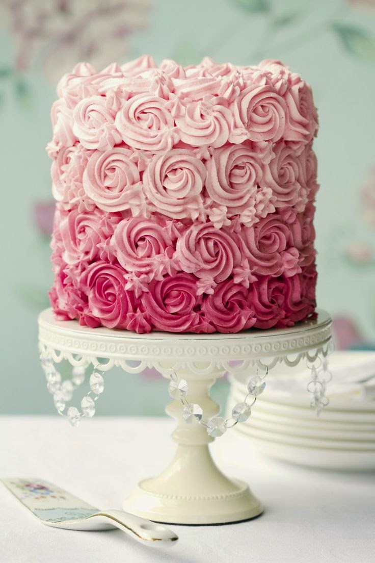
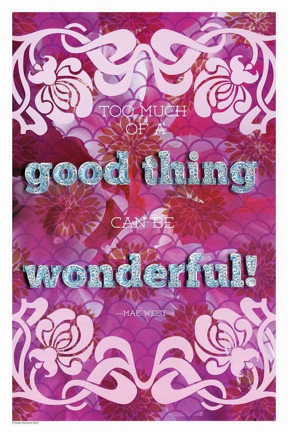
Her famous "let them eat cake" has been repeated thousands of times - and, like Mae West's "come up and see me sometime," is totally misquoted! The queen never said it.
The front cover features a vintage metal and enamel picture frame, to which I've added a contemporary piece of rhinestone jewelry in the shape of a crown along with fabric and paper flowers and metal, ribbon and pearl embellishments. The image of the queen, somewhat dulled in the photo due to attempting to reduce the glare of the glass, is rich in deep blues, greens and reds.
The spine features ribbons adorned with strands of elegant beads, chains, and a porcelain doll with a rhinestone crown. The ribbons do double duty - not only do they add luxe embellishment to the outside of the album, in addition to epoxy, red-line double stick tape and staples, they help hold the
binding into the cover. The pages were heavy, and I wanted to make sure they weren't going to go ANYWHERE!
The first page spread is the inside front cover, featuring 'toinette in one of her famous hats, as well as a contemporary rendering of her done in digital art by Cassandra at
Cassiscreations. I've added gold foil paper doilies, fabric flowers, paper flowers, ribbons and a silk butterfly. The first page has a pocket decorated with a spray of lovely paper flowers and rhinestones, as well as a die cut crown pattern, which holds two tags to either be used as photo mats or enjoyed with the images of Marie. It's finished off with an amethyst rhinestone crown.
The second page spread has a corner ribbon on the left side, embellished with frilled silk and fabric flower, which holds a tag with a charming cameo of Marie Antoinette. The right side features two 'life up' pages (you can see where they are by the gold tassels that lift each page). The main page features a novelty pewter pressing of Marie surrounded by handmade paper flowers. The crystal dangling from the top of the page is a stunner!

The next photo has one of my photo "oops" in it. On the left side, the two diagonal corner pieces are actually a pocket which holds the tag with the portrait of Marie with the umbrella you see in the upper pocket. I'm not quite sure how it got up there. Oh, well. The other tag is a beautiful piece of vintage french letter writing. The entire page is trimmed out in gold rhinestone banding. On the right side page, there is a charming portrait of the queen with the Dauphin and Dauphine. The page is embellished with faux gems, gold lace ribbon, and a yummy looking laser-cut die cut French pastry.

This spread is pretty self explanatory - the trim on the left side page is Dresden Scrap, appropriate with Marie's Austrian heritage - and I love the gold flocked paper that is behind the pocket holding thte tag with her portrait. On the right, the pocket is trimmed with pleated book page paper and black ribbon printed with gold fleur de lis. The jewel in the middle of the tag is of unknown metal to me, and the faux gems are very sparkling in a rainbow of colors.

Ah! I love the colors on this page spread! You can't really tell from the photo, but the red design on the lime green paper is glittered and the red glitter tulle is bunched with a beautiful gold filligree crown. The colors in the portrait of Marie are deep and luscious and rich. The portrait is actually a page that folds open and there is another image inside the page. On the right is a piece of some of the most beautiful lace I've ever seen. I've had a small piece of it for a decade or so, not really knowing what to do with it. Without doubt, it was just right for the Queen of Versailles! This is the same portrait that is on the cover the album, but you can see more of it (on the cover, the vintage mat covers up quite a lot of it). Again, you can't tell from the photo, but the design on this page is also glittered and sparkles quite a lot!

Well, here we go again - another "oops" moment. Because I couldn't photograph the book standing up (it would close up on its own), I had to photograph it while it was laying flat. That is why the vintage jet beading (which is gorgeous!) is laying off to the side - in reality, it falls straight down as fringe is meant to do! This beautiful image of Marie is enhanced with a luxe paper flower and black eyelash trim. Behind the tag is an exceptionally elaborate embroidered and sequinned gold lace embellishment. On the right is a delightful whimsical image of Marie with an exaggerated version of her well-known over-the-top hair stylings. It is trimmed out in rhinestones and the pages is trimmed with silk ruffles, rhinestones and a laser-cut die cut royal crown. The background paper is a beautiful piece of flocked goods.

The final spread has on the right side a waterfall feature - four images of Marie Antoinette which lift so the ones under can be viewed. The page is trimmed in fabric roses, ribbon and pearls. On the right is another satirical view of Marie's famous hair fabrications - this one looks to be about four feet high and features a complete sailing ship! Her (never said) famous quote is at the bottom and the page is trimmed out in various gorgeous renderings of laser-cut die cut French pastries and cakes.
I hope you enjoyed your little tour through my latest creation. I had a lot of fun playing with the images of 'toinette, vintage jewelry and trims and contemporary reproductions.
While you're here, be sure to scroll down and enter the giveaway for a free copy of Somerset & Company's "Art Quit Studio Winter 2015" publication!
And, then, go make something beautiful ...
¸.•´¸.•*´¨) ¸.•*´¨)
(¸.•´ (¸.•´♥ Tristan ♥